
Outdoor Guide stands for competent and comprehensive information about the world of outdoor sports. It’s a Swiss magazine covering all kinds of outdoor sports that is published twice per year. You can find useful equipment reviews, inspiring interviews and portraits, detailed tour recommendations and stunning stories about all sorts of adventurous expeditions.
Made in collaboration with Outkomm GmbH
Outdoor Guide stands for competent and comprehensive information about the world of outdoor sports. It’s a Swiss magazine covering all kinds of outdoor sports that is published twice per year. You can find useful equipment reviews, inspiring interviews and portraits, detailed tour recommendations and stunning stories about all sorts of adventurous expeditions.
MADE AT Outkomm GmbH
KEYWORDS
brand identity.
editorial design.
illustration.
outdoor.
magazine.
RESPONSIBILITIES
layout.
creative direction.
illustration.
The aim was to redesign the complete brand identity of this outdoor magazine, but to keep the balance between in-depth product know-how and inspiring personal stories. The main target group consists of highly educated men with an interest in alpine outdoor activities.
THE OBJECTIVE: How it all starts.
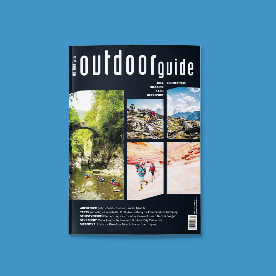
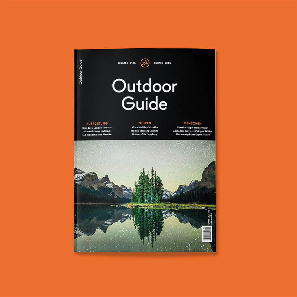
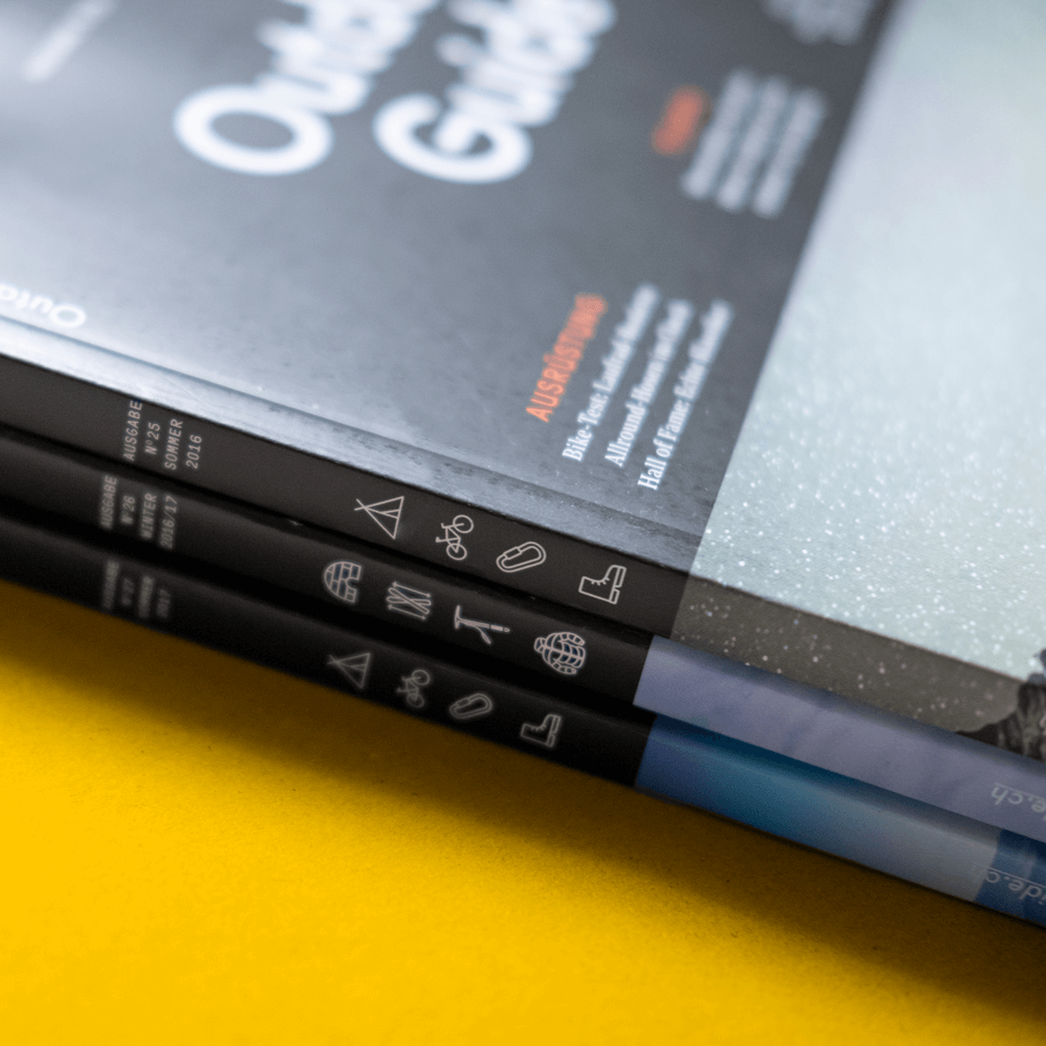
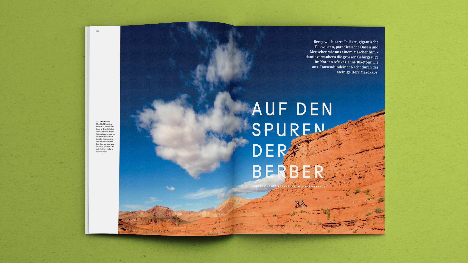
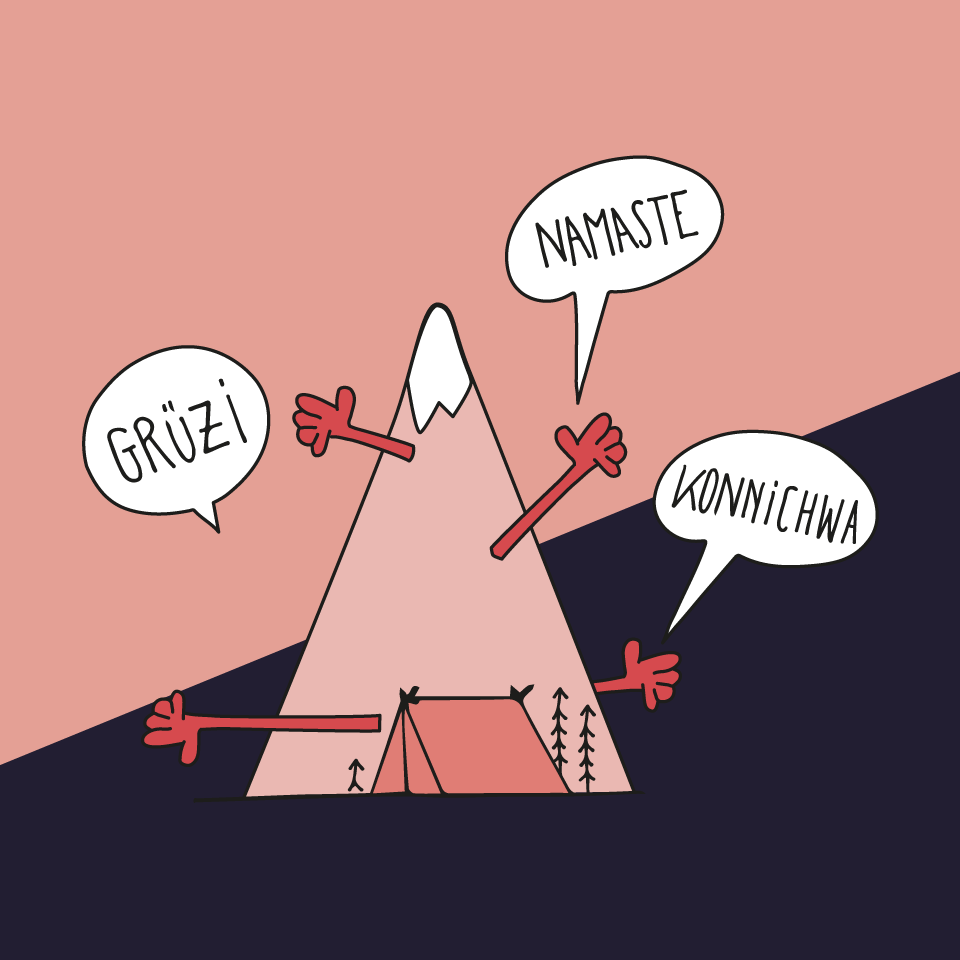
Throughout the whole redesign process, we needed to preserve a careful balance between showing a sufficient level of expertise and not overwhelming readers with too much purely factual information. In addition, the magazine doesn’t focus on one sports activity only, so it was important to make the multi-sports approach visible at first glance: on the cover. Therefore we developed the little activity icons that are shown on the spine of each magazine.
THE PROCESS: Our journey from idea to execution.
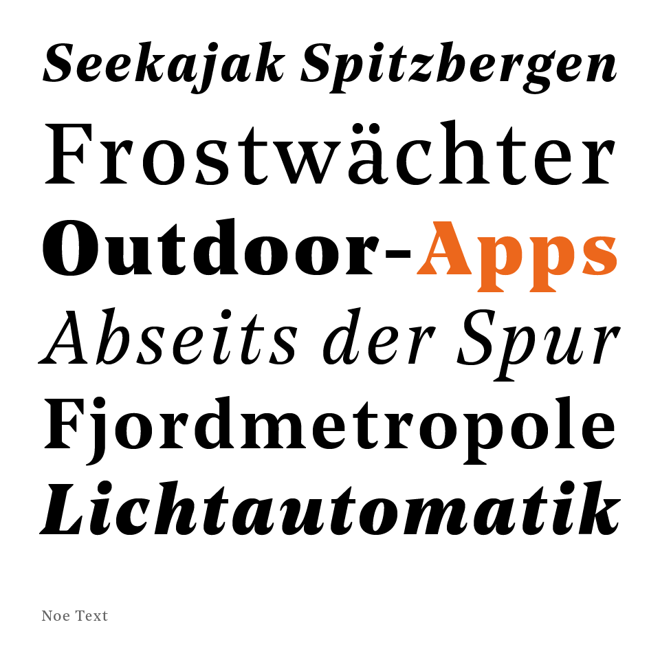
The logo is based on the font Fugue. It has distinctive characters, yet with some playful details. In the magazine, Fugue is combined with the font Noe Text, which has sharp, triangular serifs.
TYPOGRAPHY: How a font empowers the visual identity.
The logo is based on the font Fugue. It has distinctive characters, yet with some playful details. In the magazine, Fugue is combined with the font Noe Text, which has sharp, triangular serifs.
TYPOGRAPHY: How a font empowers the visual identity.
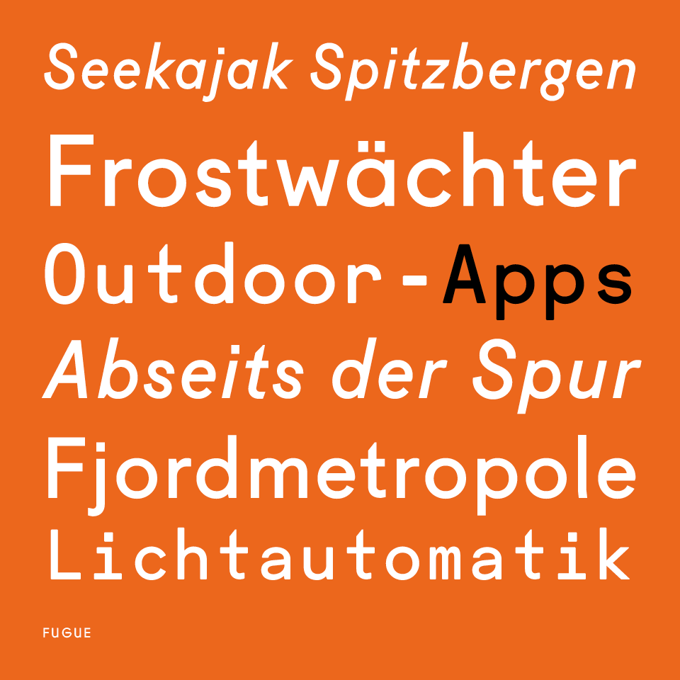
In the magazine, Fugue is combined with the font Noe Text. A font with sharp, triangular serifs to give it a crisp character. This sharpness recalls the roughness of nature. The characteristic serif with optimal legibility is both used for headlines and body text. It goes well with the simplicity of Fugue.
TYPOGRAPHY: How a font empowers the visual identity.
The wordmark we developed can be used with or without the mountain icon. The chosen typeface looks very clean at first sight but has some characteristic features and nice quirky details. This reflects the mission of Outdoor Guide: to show thorough product know-how, but also inspire readers with a personal touch.
THE OUTCOME: What we achieved.
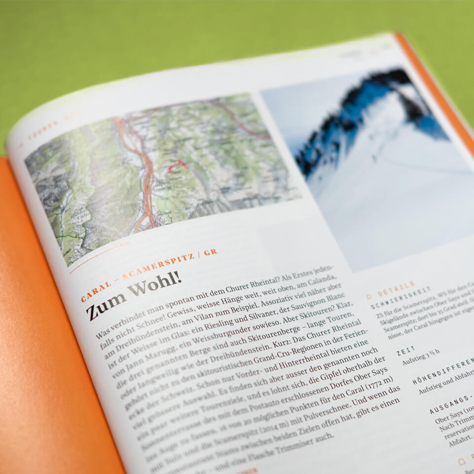
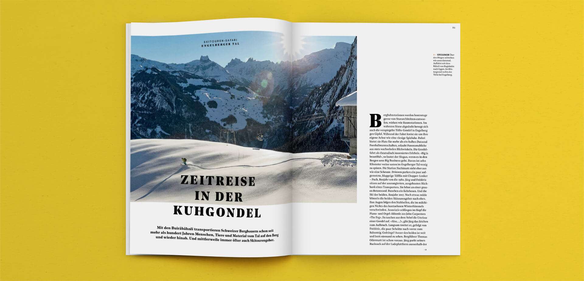
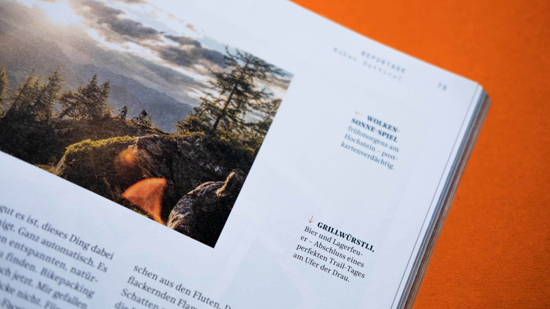
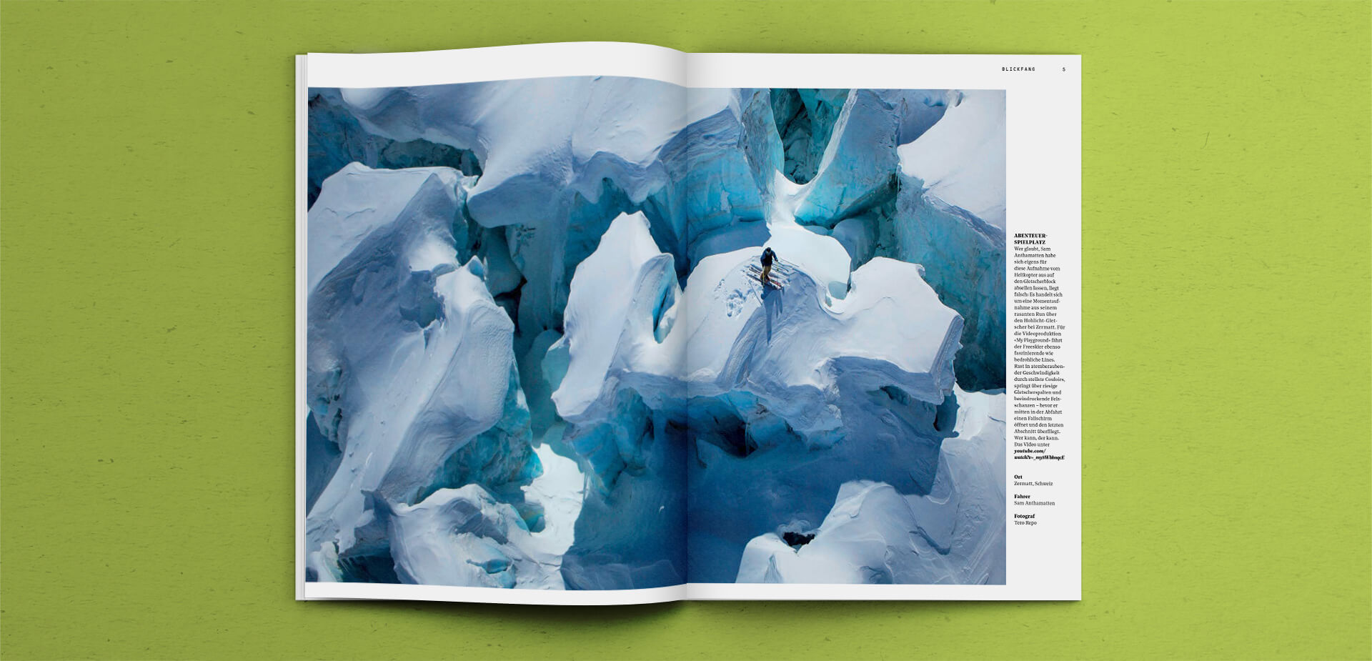
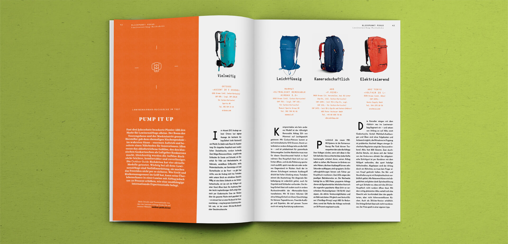
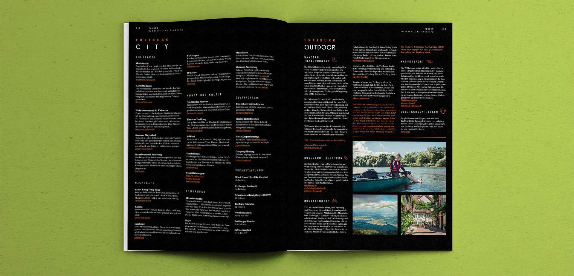
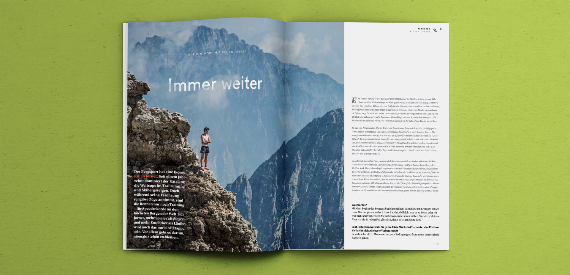
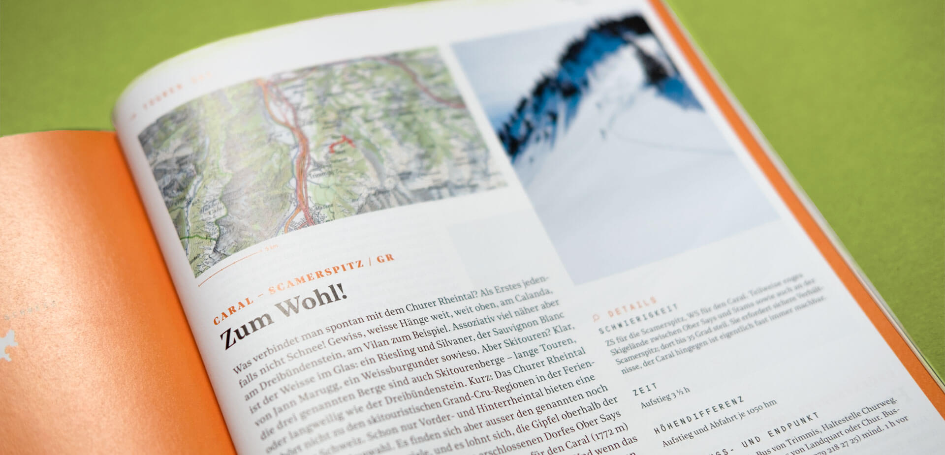
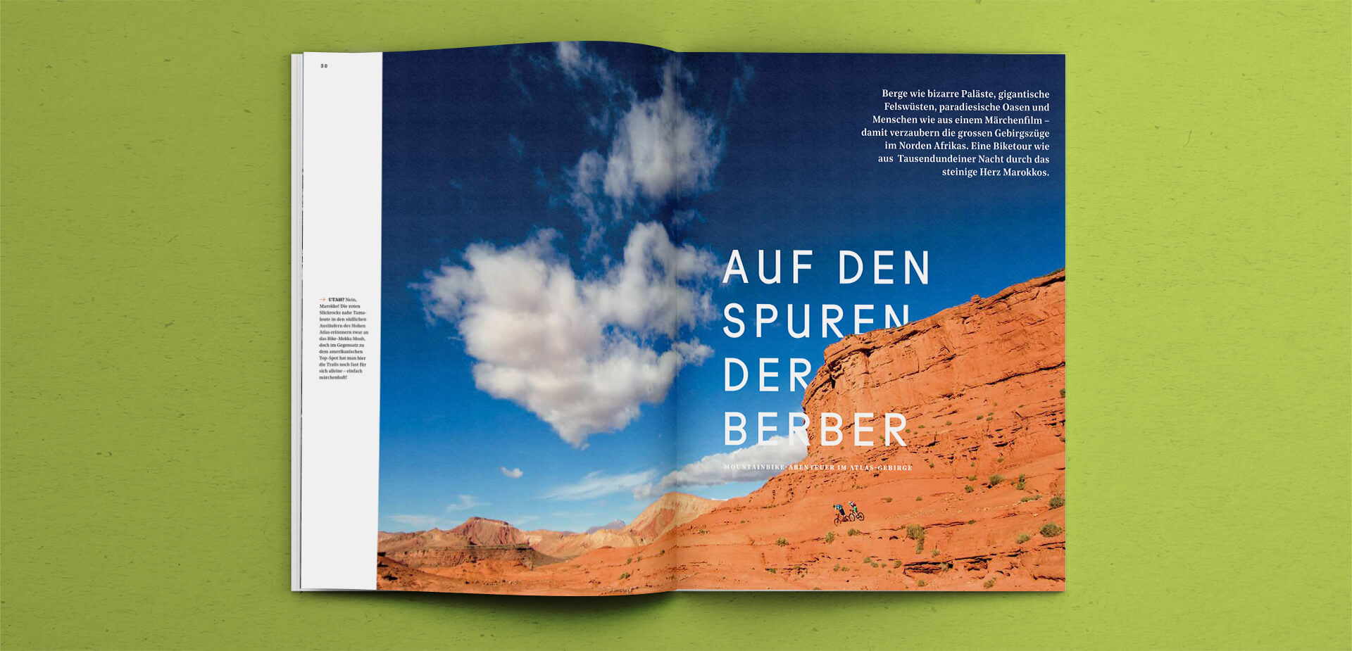
Large visuals are key for the main stories. We use a flexible system of columns to add background information, include image captions or refer to other interesting topics. These know-how columns are a well thought-through design element which emphasizes the expertise that Outdoor Guide provides its readers.
LAYOUT: How we arranged all the different visual elements.
More work.
Berg & Macherbrand design
Brukseilasbrand design
akzenteux & ui design
Editorial artworkillustration

Kustermanneditorial design
Omnevabrand design
Siemens Financial Servicescorporate editorial design
supertrail.guidecorporate identity
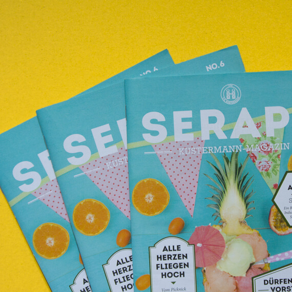
Seraphvisual identity
Logotypeslogo design