
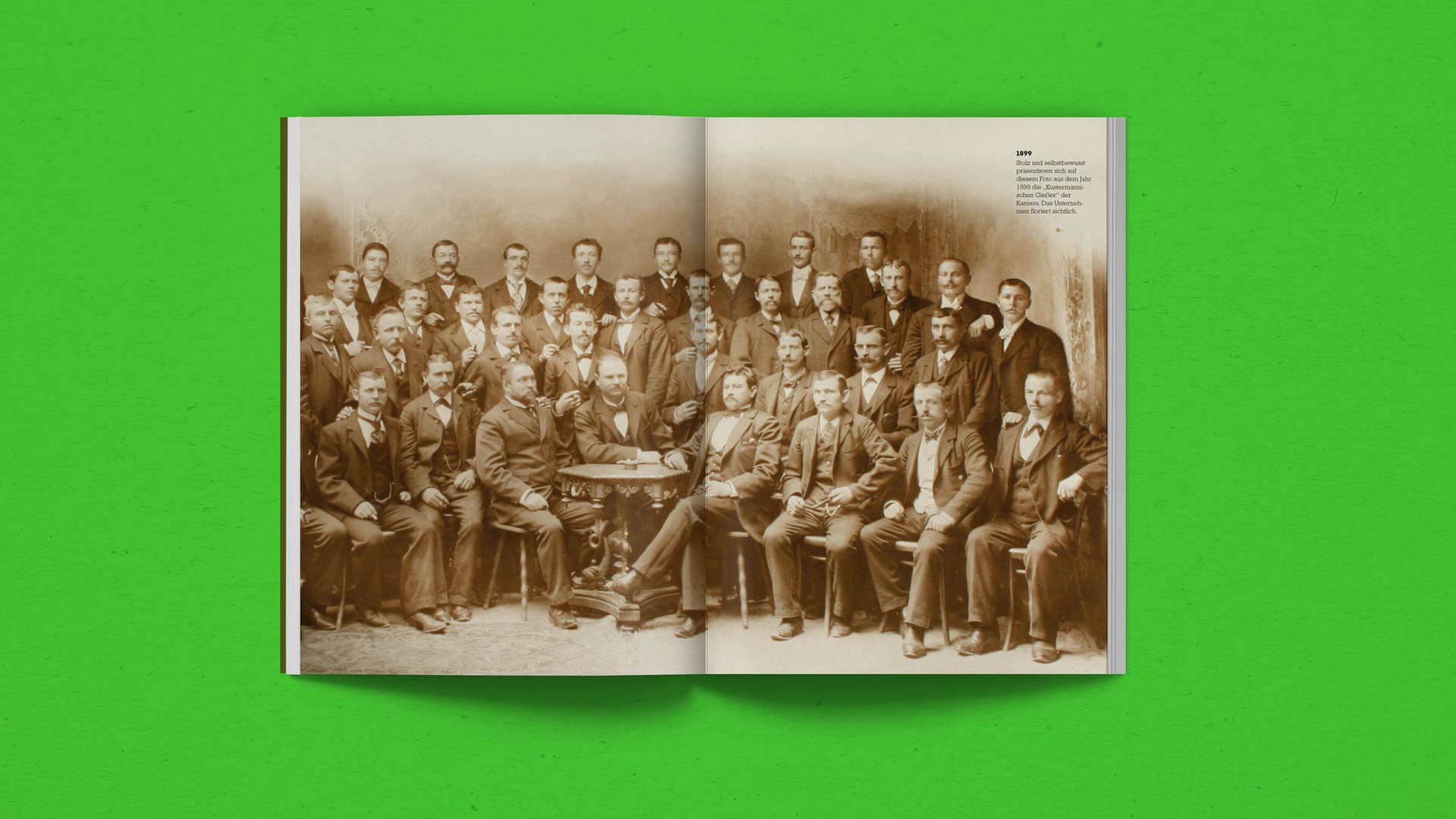
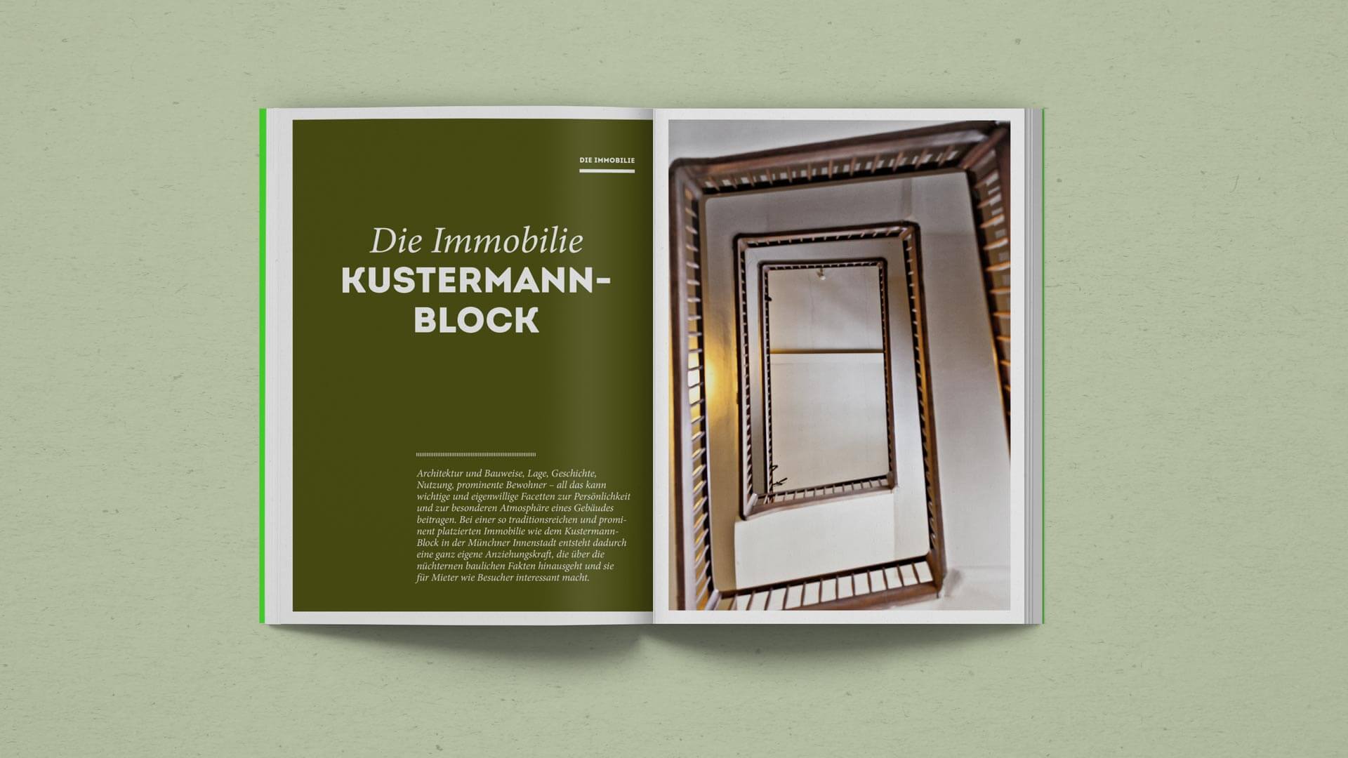
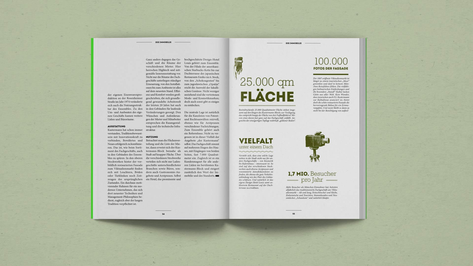
Kustermann, a family-owned business, is one of the few full-range retailers in Germany and sells an extensive range of products, stocking over 70.000 items. Based already for over 120 years at the well-known Viktualienmarkt in the very center of Munich, the Kustermann store has become a firmly established landmark in the city and far beyond.
Made in collaboration with Factor Product GmbH
Outdoor Guide stands for competent and comprehensive information about the world of outdoor sports. It’s a Swiss magazine that informs twice a year about trekking, mountaineering, biking, canoeing, backcountry skiing, snowboarding and free riding. You will find very useful equipment tips, inspiring interviews and portraits, thorough tour recommendations and stunning stories of all sorts of expeditions.
KEYWORDS
brand identity.
editorial design.
family-owned business.
munich.
RESPONSIBILITIES
visual concept.
layout.
image selection.
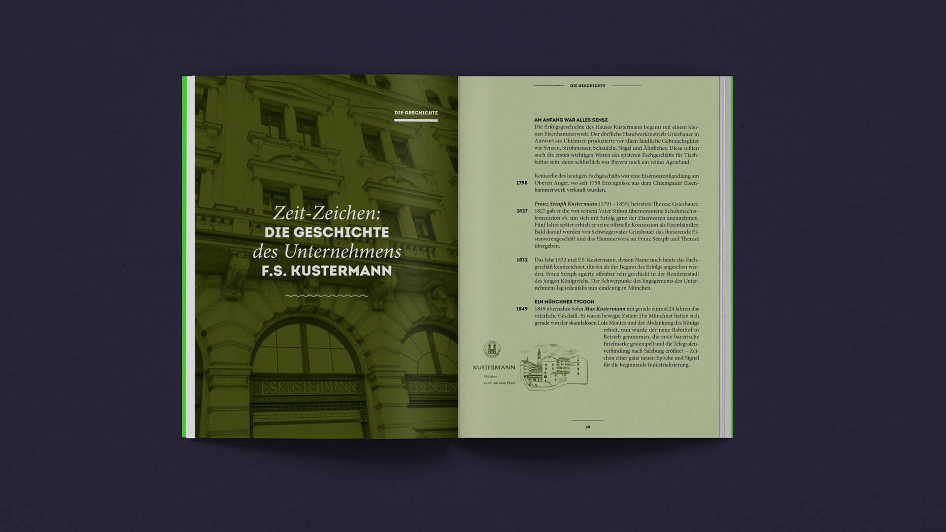
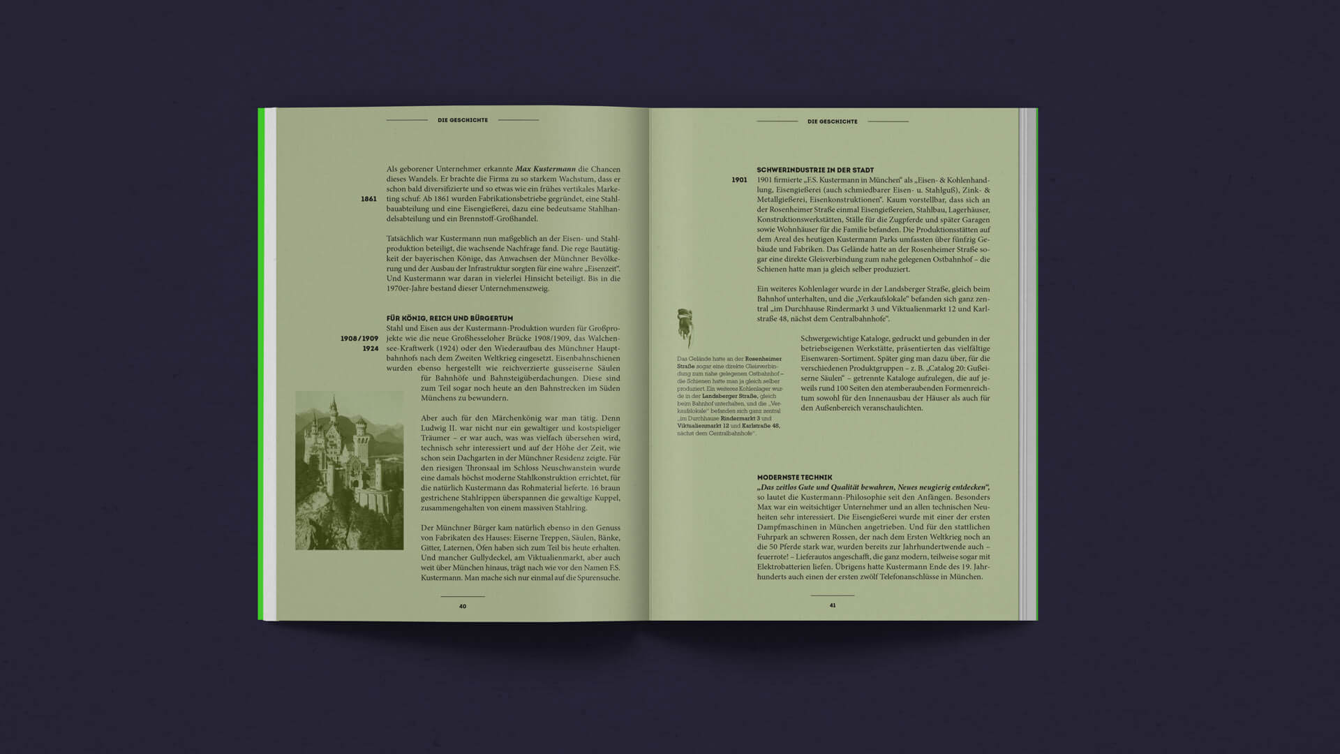
Create an attractive brochure that reflects Kustermann’s core values. The brochure covers stories, achievements and ambitions from the past, present and future of this established Munich family enterprise. It will be used to give potential partners a thorough insight into the remarkable history of the business, the store itself and the impressive building.
THE OBJECTIVE: How it all starts.
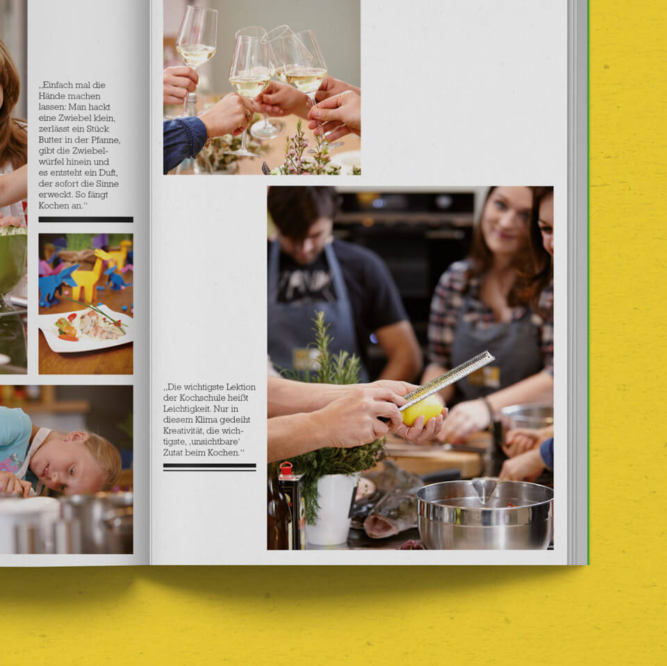
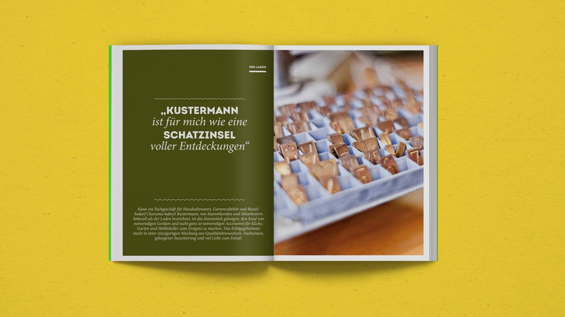
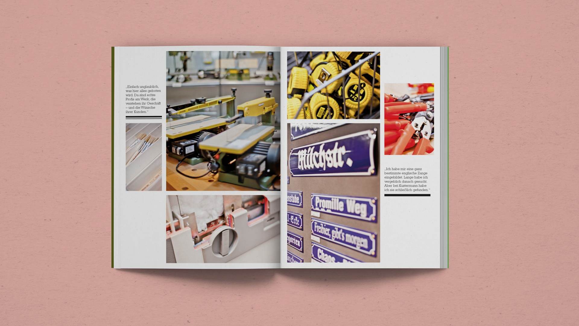
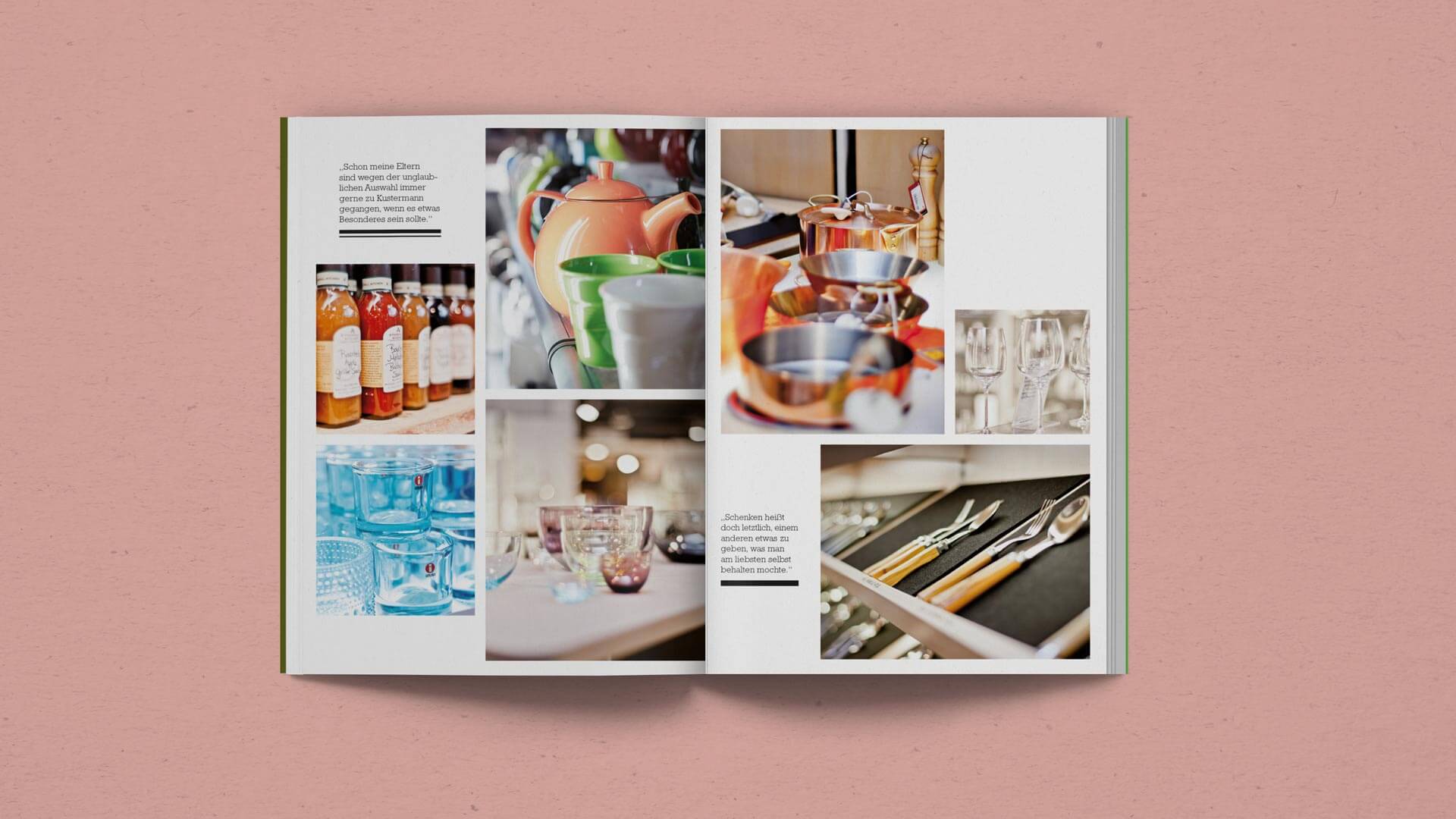
From the beginning it was clear that we wanted the readers to immediately get a strong feeling for the Kustermann brand and store. For this reason, the first part of the brochure is predominantly filled with evocative photographs from the store and the cooking classes that are organised there on a regular basis.
THE PROCESS: Our journey from idea to execution.
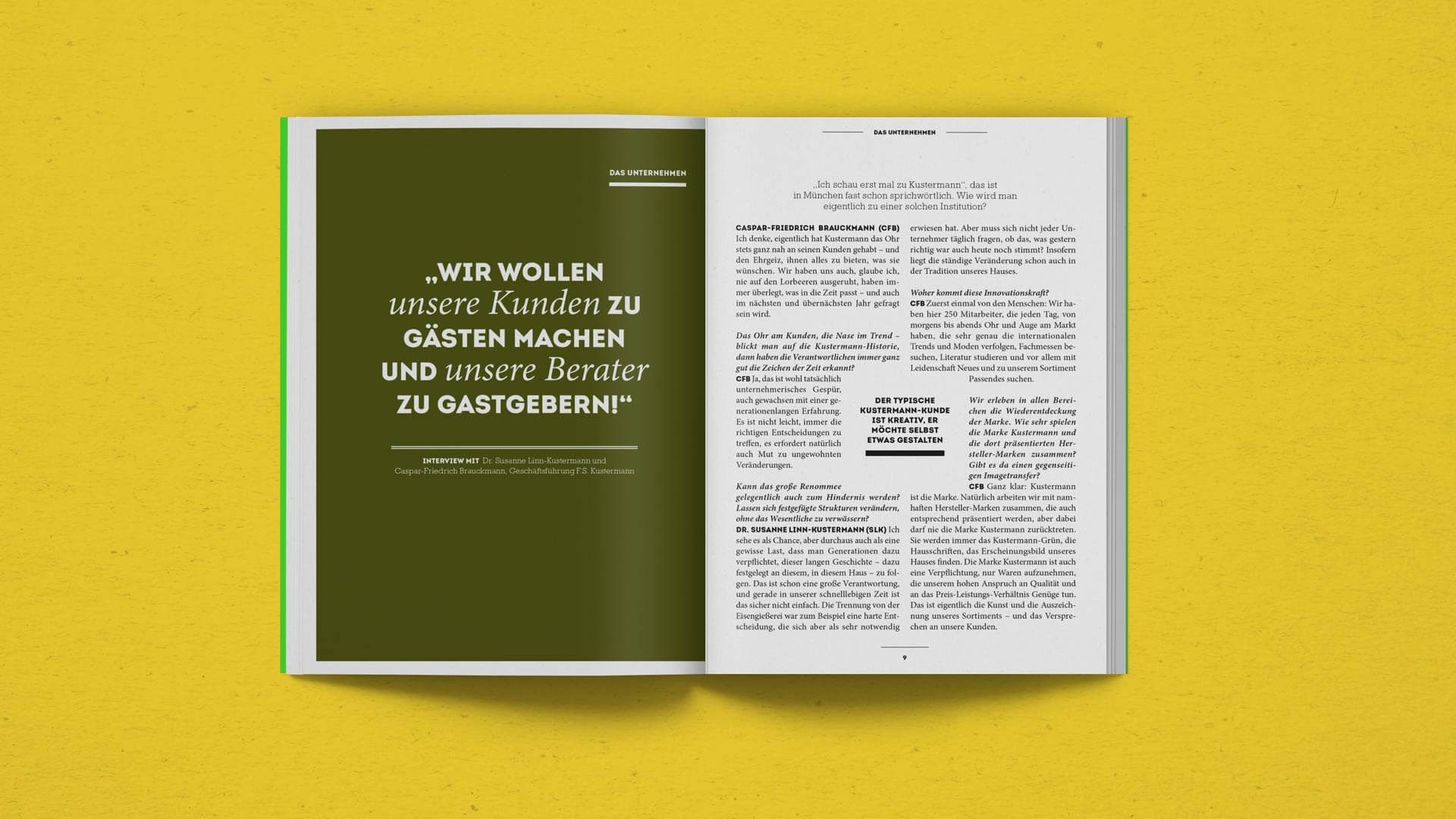
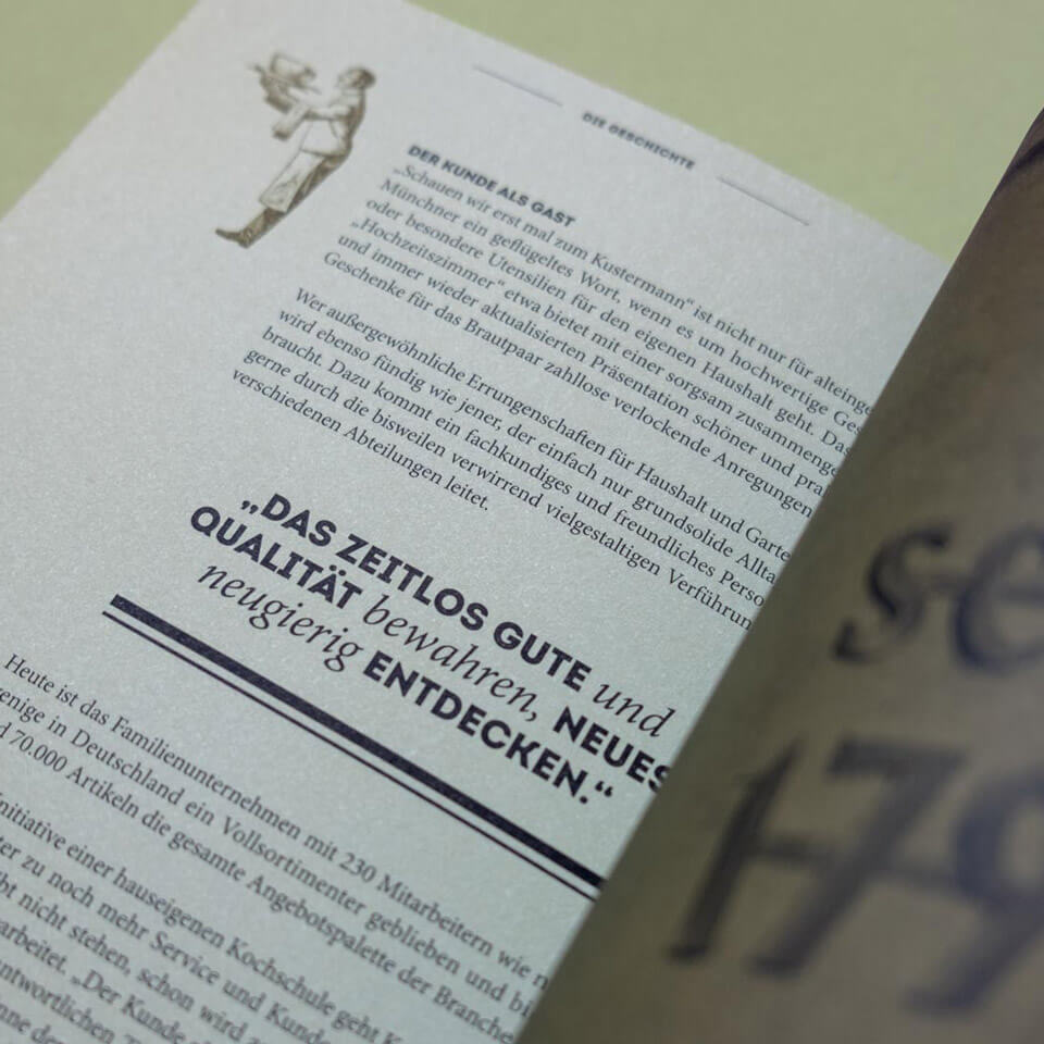
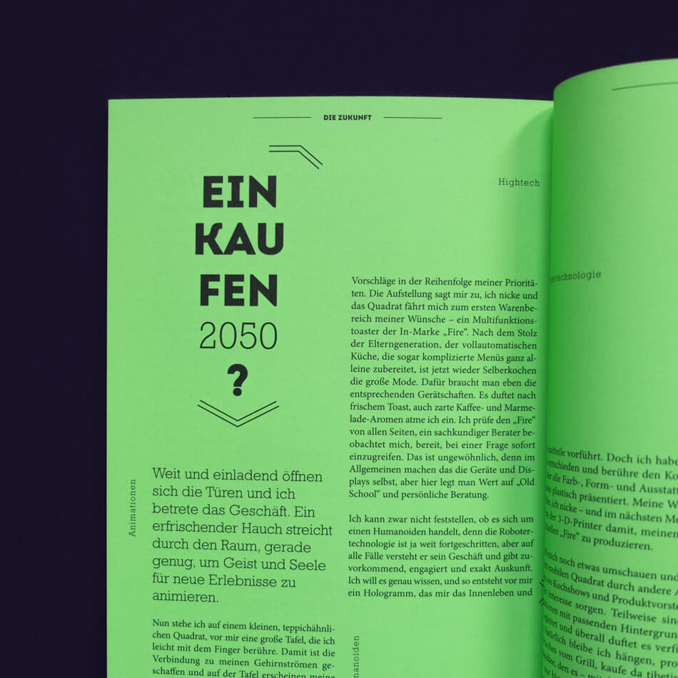
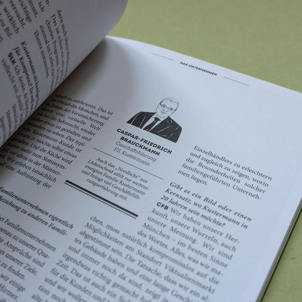
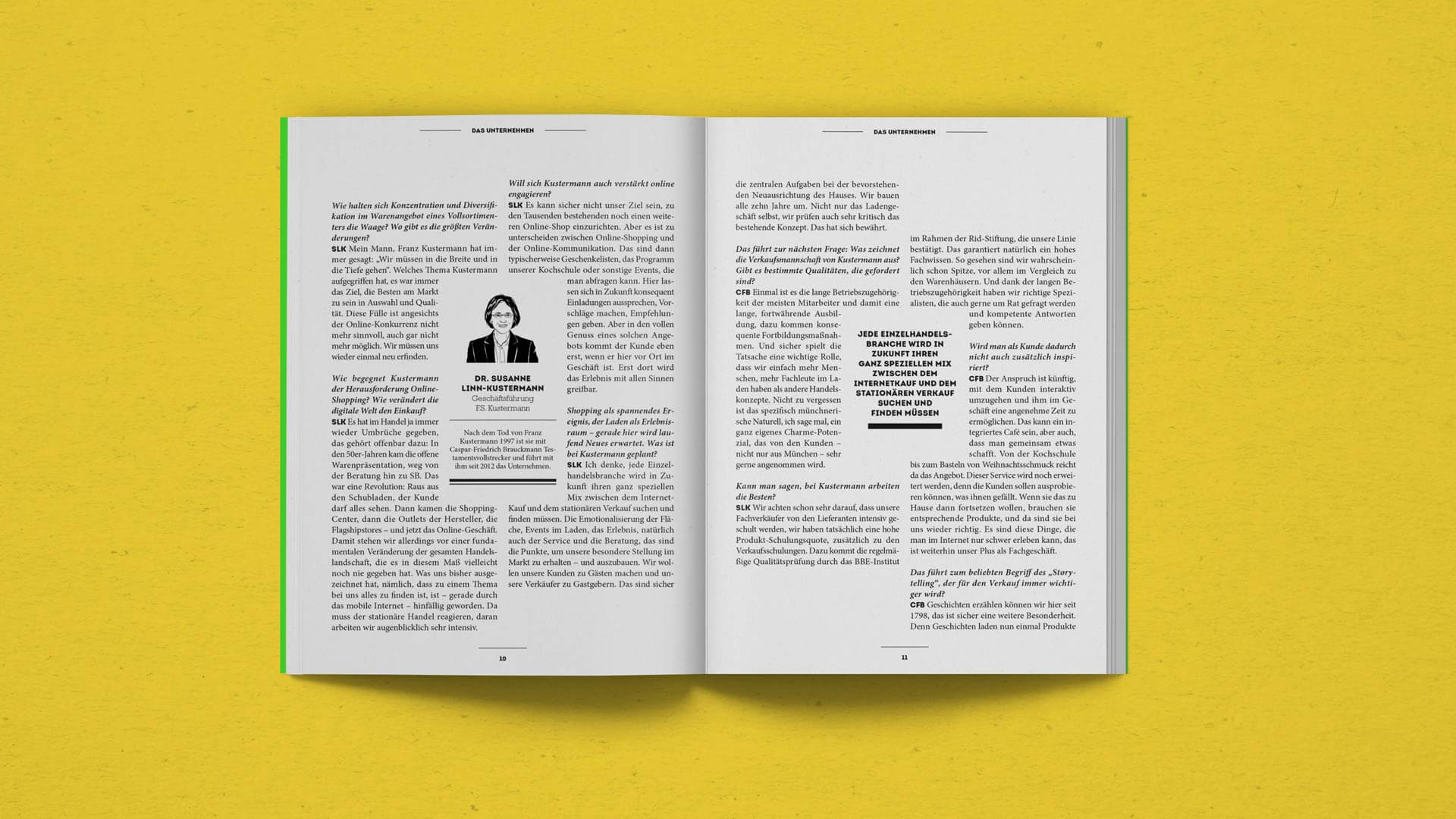
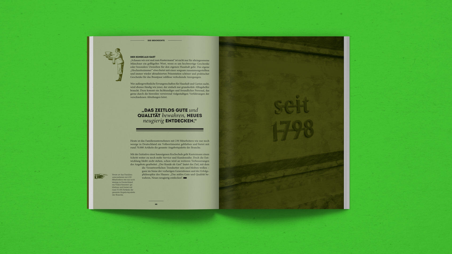
To engage a target audience with limited time, we decided to focus on strong visuals, combined with well-chosen , quotes and small bite-sized information blocks throughout the whole brochure. In addition, there are some long reads – interviews and a brief company history – that give a deeper and more thorough understanding of Kustermann’s vision and values. Quotes, historical photos and illustrations are used to make these longer texts more inviting and easier to digest.
THE OUTCOME: What we achieved.
More work.
Berg & Macherbrand design
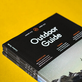
Outdoor Guideeditorial design
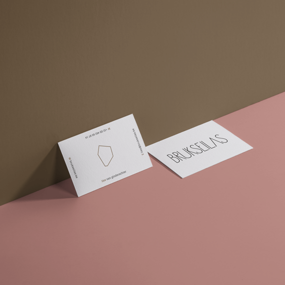
Brukseilasbrand design
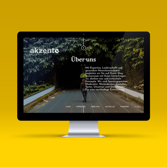
akzenteux & ui design
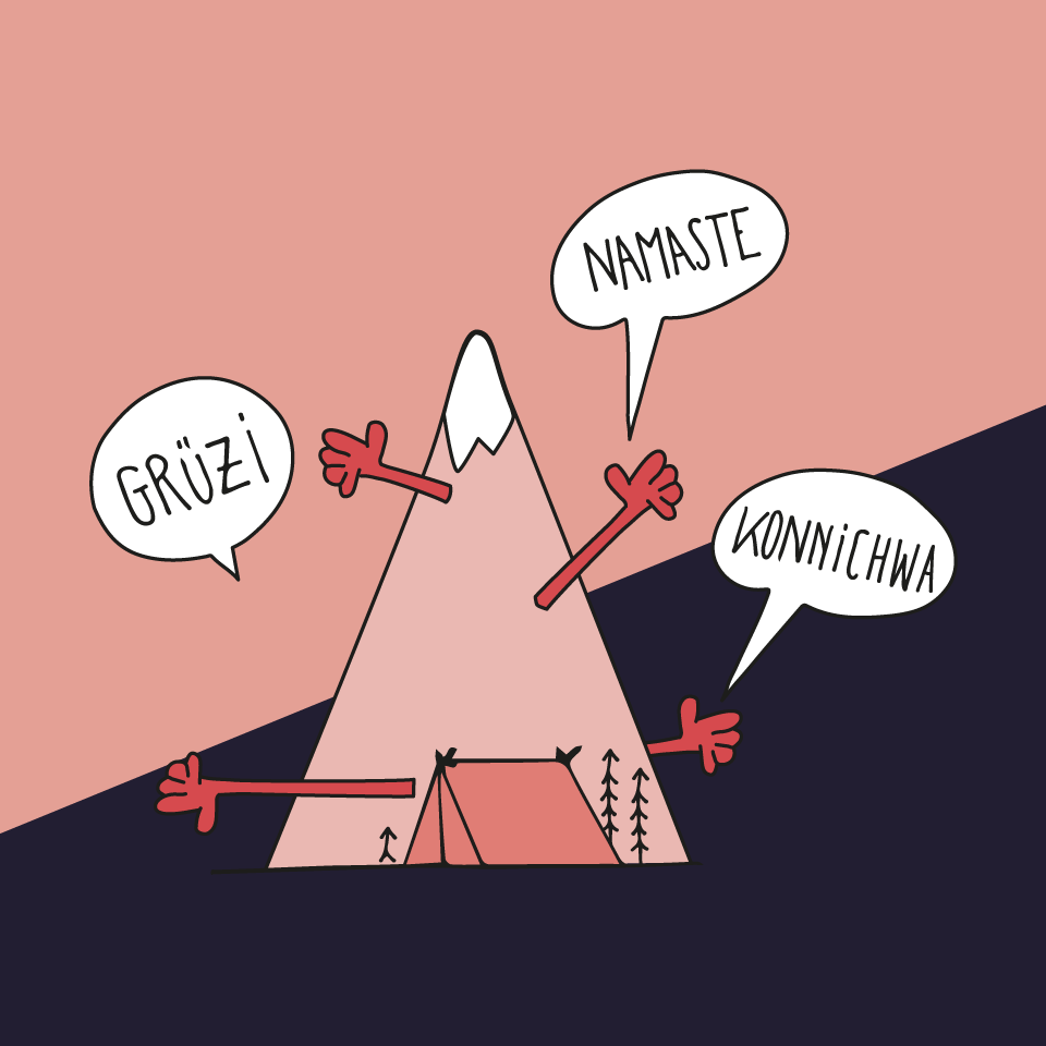
Editorial artworkillustration
Omnevabrand design
Siemens Financial Servicescorporate editorial design
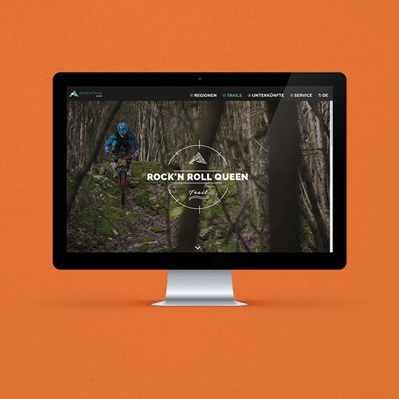
supertrail.guidecorporate identity
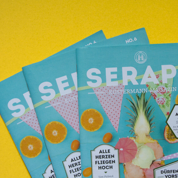
Seraphvisual identity
Logotypeslogo design