
Berg & Macher is a company for organizational transformation, new work consulting & team coaching to strengthen organizations and to achieve team goals and visions. As a companion for transformation, they use their own Berg & Macher® method to better connect people within their team and within their organization. As a plus they offer their services at beautiful (outdoor) locations in the mountains.
Berg & Macher is a company for organizational transformation, new work consulting & team coaching to strengthen organizations and to achieve team goals and visions. As a companion for transformation, they use their own Berg & Macher® method to better connect people within their team and within their organization. As a plus they offer their services at beautiful (outdoor) locations in the mountains.
Berg & Macher is a company for organizational transformation, new work consulting & team coaching to strengthen organizations and to achieve team goals and visions. As a companion for transformation, they use their own Berg & Macher® method to better connect people within their team and within their organization. As a plus they offer their services at beautiful (outdoor) locations in the mountains.
KEYWORDS
brand identity.
web design.
logo design.
new work.
team development.
RESPONSIBILITIES
creative direction.
lead design.
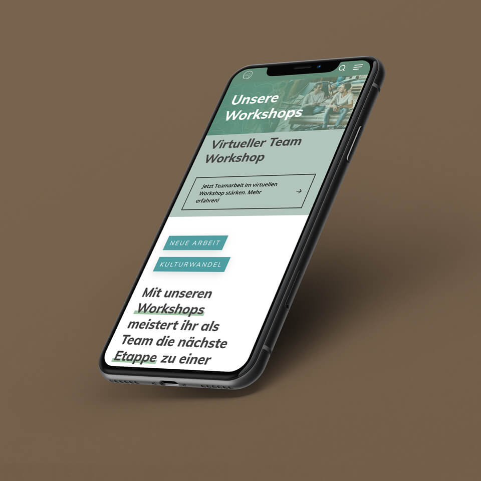
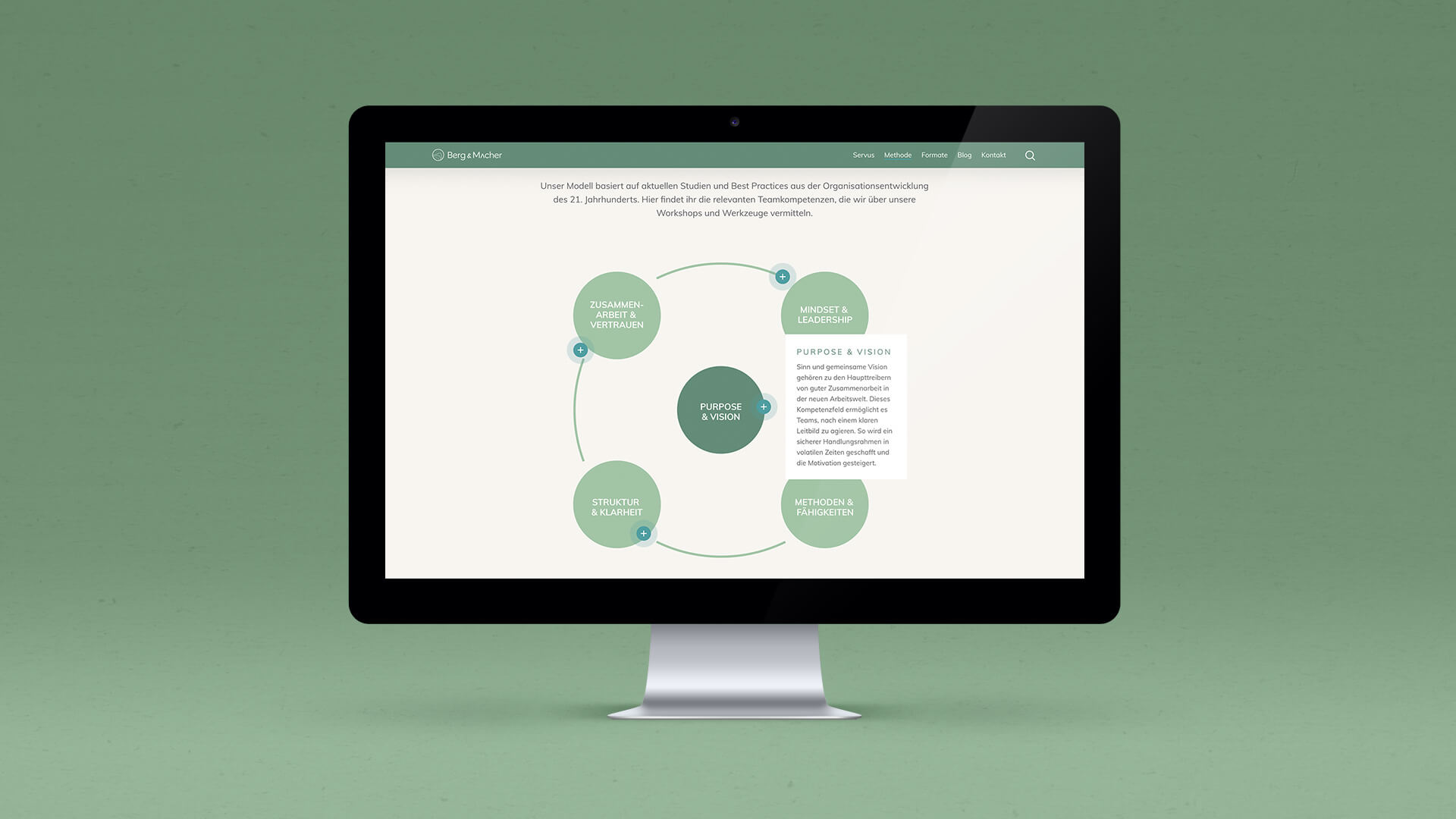
Create a brand identity that resonates with their mission to “connect people in a team and with the organization” and that comes across as warm, authentic and friendly. They are not afraid to take a statement, but always in a thoughtful, non-judgemental way. With their relevant content they want to be a good companion. As they operate mostly in an outdoor environment, they want to associate their services with the idea of an expedition or a hike in nature.
THE OBJECTIVE: How it all starts.
The name was already fixed when we started working on the project. The client also did some extensive market research, so the positioning was quite clear and well prepared. We worked on the look and feel of the brand, by showing some conceptual directions through mood boards, logo variations, fonts and colours. Through a profound exchange with the client, we executed and developed one final direction for the visual identity.
THE PROCESS: Our journey from idea to execution.
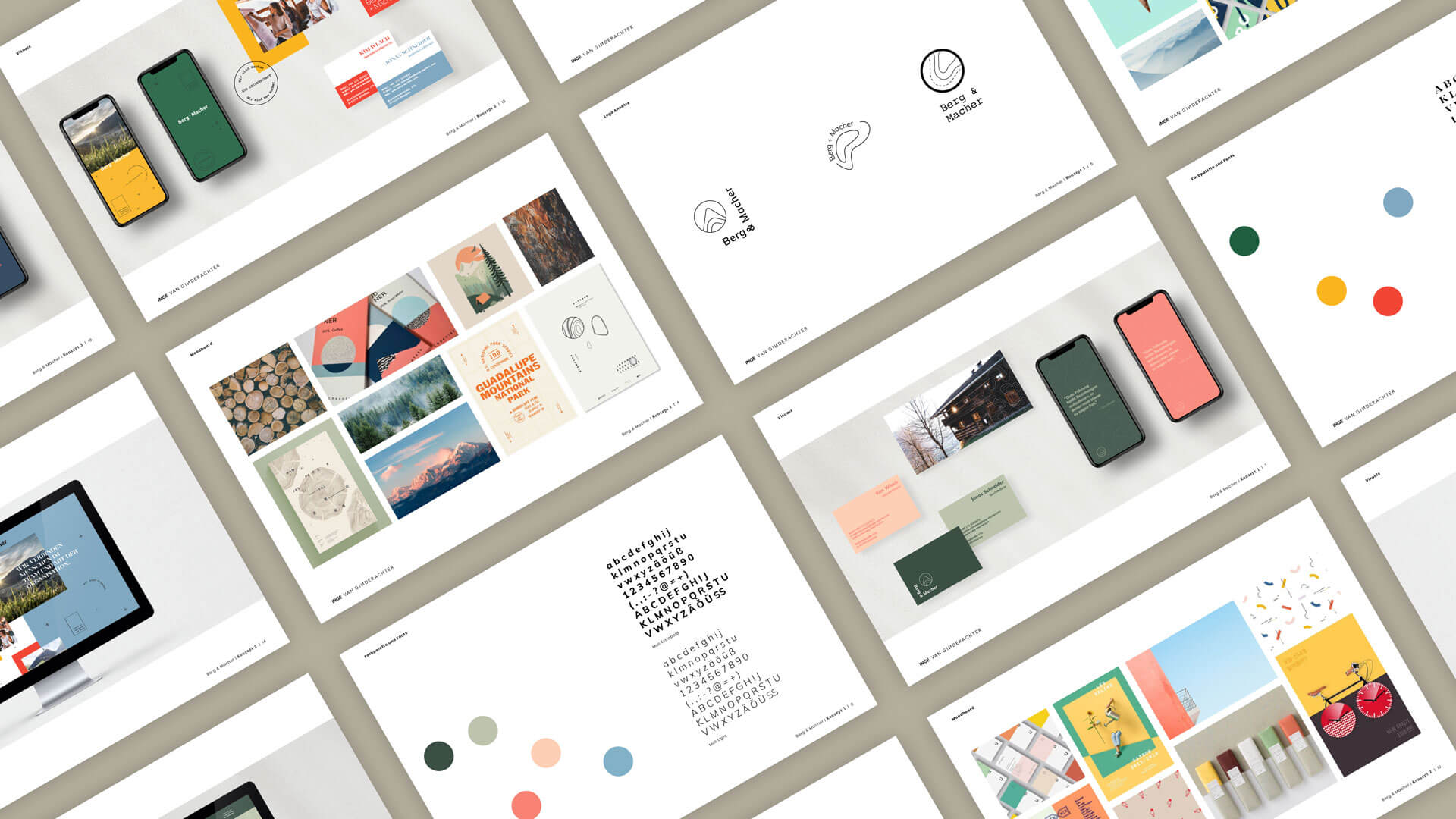

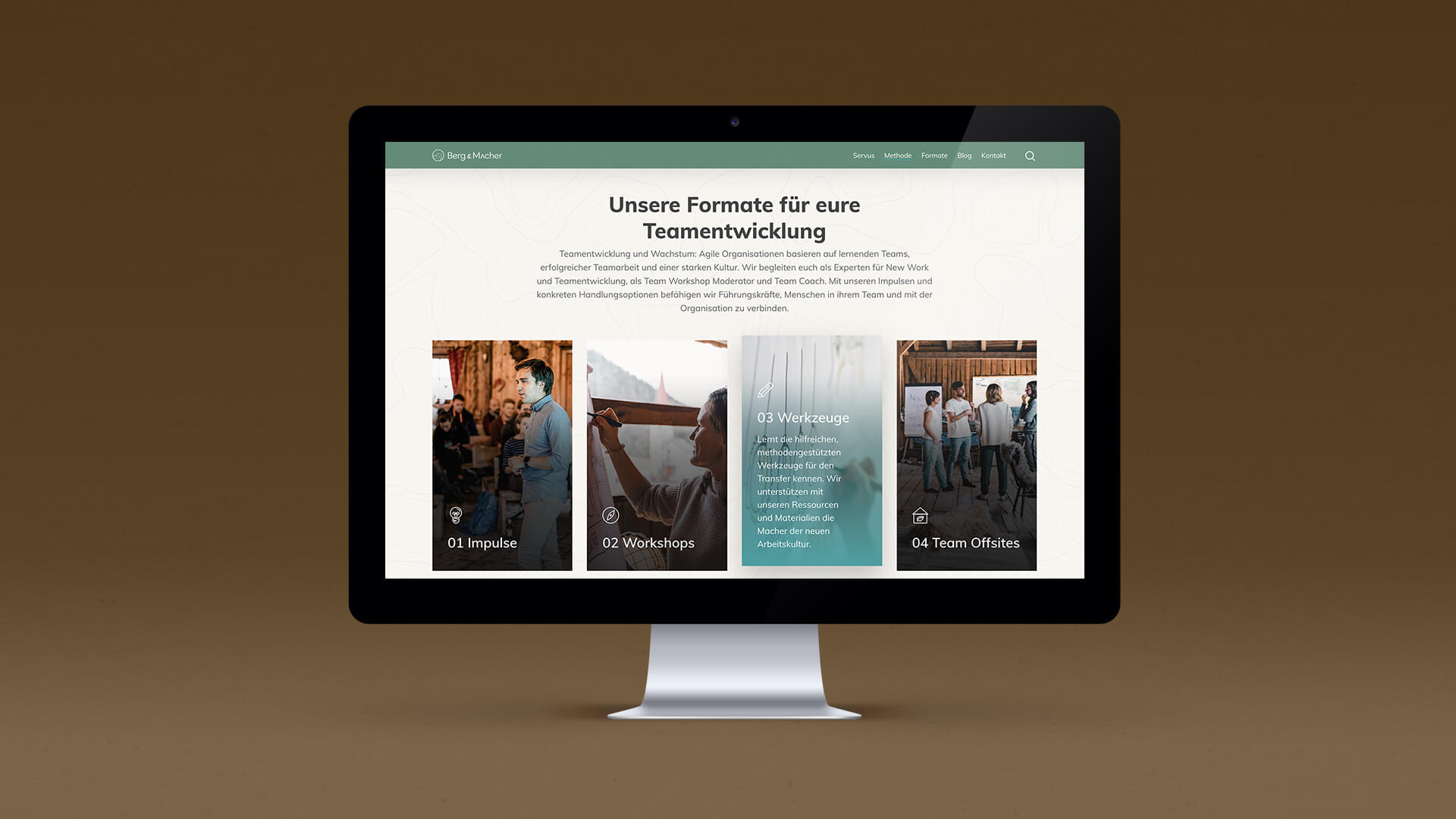
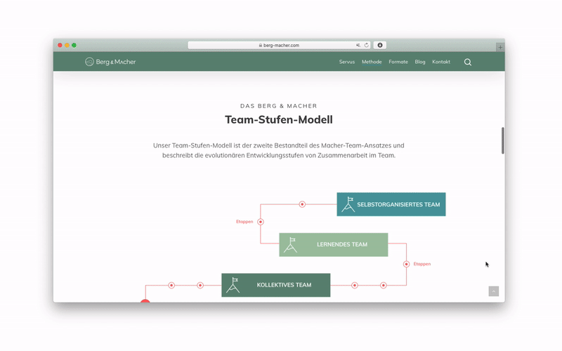
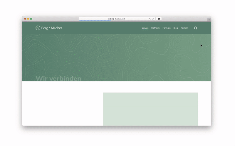
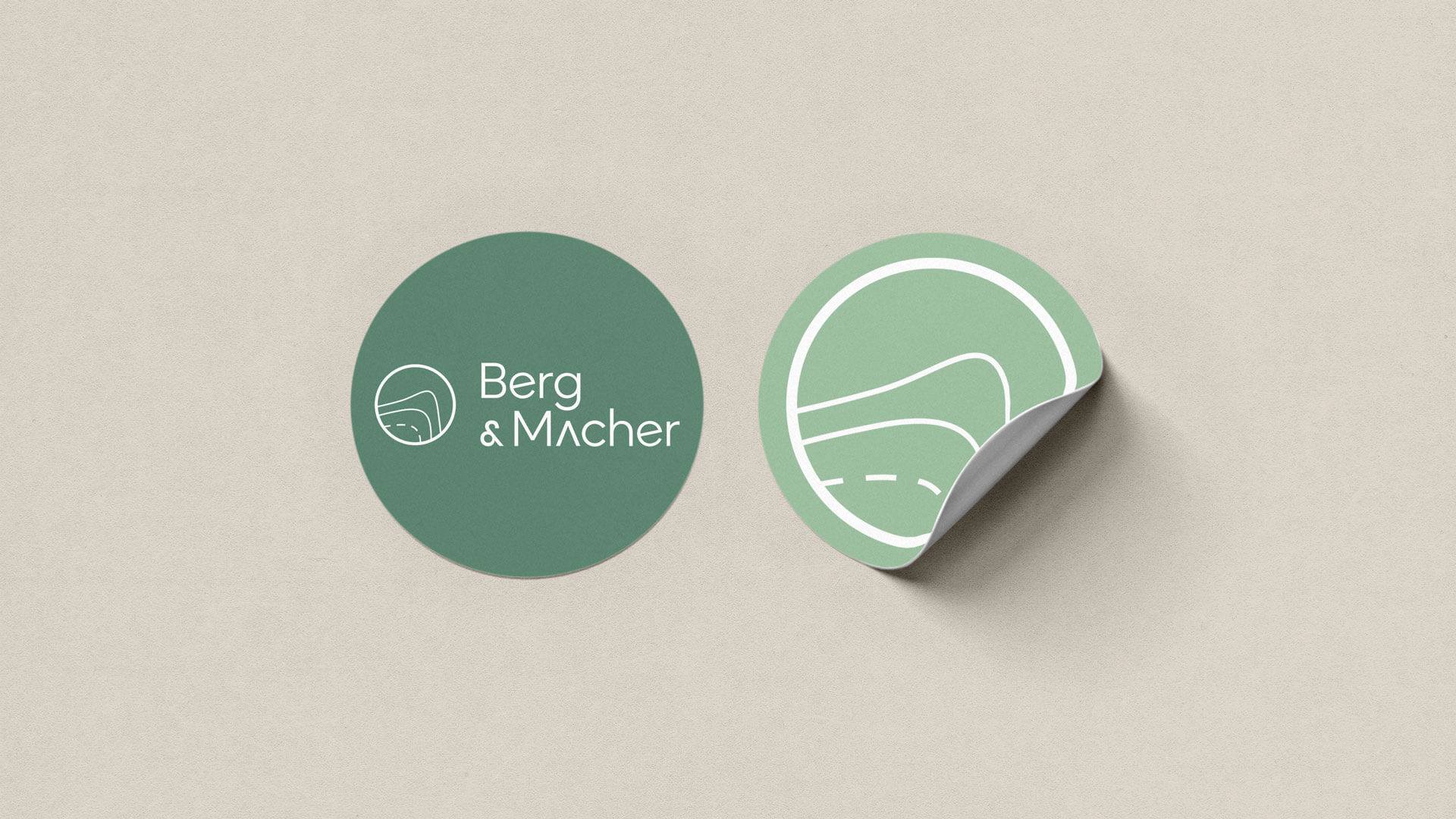
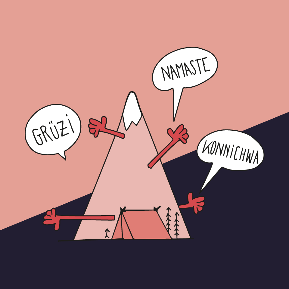
We came up with the concept: Nature is your favourite guide. We took some elements from nature, but also guiding elements from a map, as Berg & Macher is your best companion on the expedition to new work. The logo is based on the contour lines on the topographic map for the area close to where Hoiz Alm is situated, one of their amazing workshop locations in Austria. But it also reflects the growth rings of a tree, as Berg & Macher wants to let your team and organization grow together with them.
THE OUTCOME: What we achieved.
The wordmark we developed can be used with or without the mountain icon. The chosen typeface looks very clean at first sight but has some characteristic features and nice quirky details. This reflects the mission of Outdoor Guide: to show thorough product know-how, but also inspire readers with a personal touch.
THE OUTCOME: What we achieved.

“Inge is resourceful and fun to work with. She understood our vision for the new Berg & Macher brand right away and brought our imaginations to life. Her solution and customer oriented, creative work style made our rebranding project a complete success. We especially loved when she came up with the idea of the mountain contour lines, which became an elementary theme within our branding.”
KIM WLACH, Co-founder of Berg & Macher GmbH.
The wordmark we developed can be used with or without the mountain icon. The chosen typeface looks very clean at first sight but has some characteristic features and nice quirky details. This reflects the mission of Outdoor Guide: to show thorough product know-how, but also inspire readers with a personal touch.
THE OUTCOME: What we achieved.
More work.
Outdoor Guideeditorial design
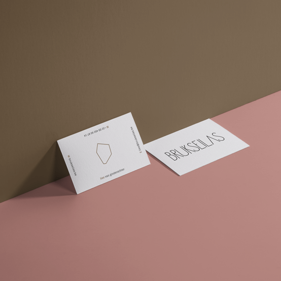
Brukseilasbrand design
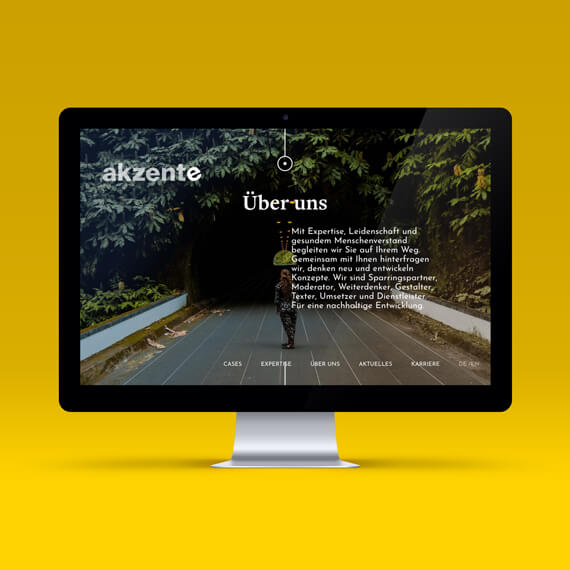
akzenteux & ui design
Editorial artworkillustration

Kustermanneditorial design
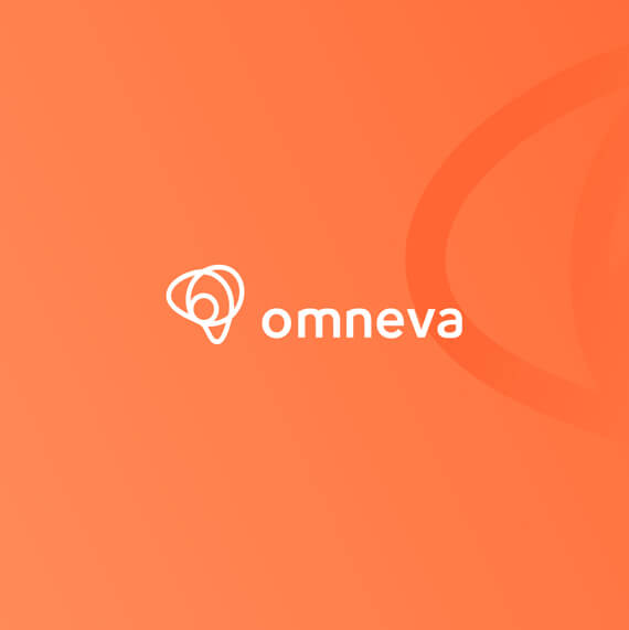
Omnevabrand design
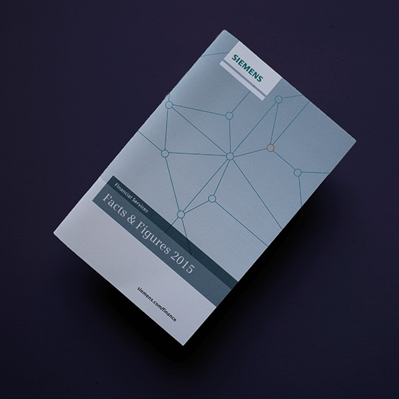
Siemens Financial Servicescorporate editorial design
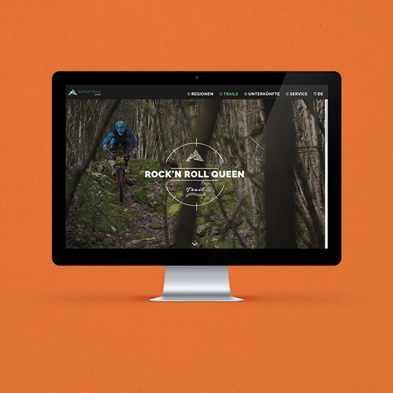
supertrail.guidecorporate identity
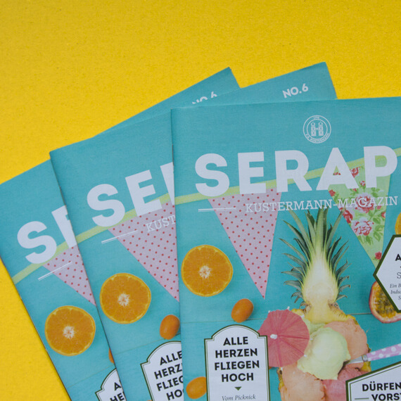
Seraphvisual identity
Logotypeslogo design